Quick Guide
The following should form a quick reference walkthough of downloading the package, getting experimental data into the right form for importing, running the inverse models to generate activation energies, importing published kinetic values and updating them using new experimental data, and generating predicted clumped isotope evolution for a given time-temperature history.
For detailed information on class attributes, methods, and parameters, consult the Package Reference Documentation or use the help() command from within Python.
Downloading the package
Using the pip package manager
isotopylog and the associated dependencies can be downloaded directly from the command line using pip:
$ pip install isotopylog
You can check that your installed version is up to date with the latest release by doing:
$ pip freeze
Downloading from source
Alternatively, isotopylog source code can be downloaded directly from the github repo. Or, if you have git installed:
$ git clone git://github.com/FluvialSeds/isotopylog.git
And keep up-to-date with the latest version by doing:
$ git pull
from within the isotopylog directory.
Dependencies
The following packages are required to run isotopylog:
- python >= 2.7, including Python 3.x
- matplotlib >= 1.5.2
- numpy >= 1.11.1
- pandas >= 0.18.1
- scipy >= 0.18.0
If downloading using pip, these dependencies (except python) are installed
automatically.
Optional Dependencies
The following packages are not required but are highly recommended:
- ipython >= 4.1.1
Additionally, if you are new to the Python environment or programming using the command line, consider using a Python integrated development environment (IDE) such as:
Python IDEs provide a “MATLAB-like” environment as well as package management. This option should look familiar for users coming from a MATLAB or RStudio background.
Importing Experimental Data
If you are using isotopylog to fit reordering rate parameters to new clumped isotope heating experiments, then the first step is to import those data in an appropriate format. This requires making a .csv file that contains the following columns:
- t
- D47
- D47_std
- d13C_vpdb
- d13C_std
- d18O_vpdb
- d18O_std
- T_C
- ref_frame
- iso_params
where the first entry contains the initial (unheated) isotope data. The “t” column can contain time points in any units (e.g., seconds, minuts, etc.), and note that the resulting rate data will correspond to the time unit used. The “ref_frame” column contains the reference frame used to generate the clumped isotope data (i.e., “Ghosh25”, “Ghosh90”, “CDES25”, or “CDES90”), whereas the “iso_params” column contains the isotope parameters used to generate the clumped isotope data (typically “Gonfiantini” for older data or “Brand” for recently generated data. See Daëron et al.(2016) for further details).
Once this table is made, it can be easily imported into an isotopylog.HeatingExperiment object:
#import packages
import isotopylog as ipl

#make a string pionting to the file
file = '/path/to/data/data_file.csv'

#import the data to a heatingexperiment object, he
he = ipl.HeatingExperiment.from_csv(file, culled = False)
Note that users can choose to cull the data such that any measurements within some threshold of the equilibrium value at that temperature are excluded (see Passey and Henkes (2012) for details). The culling threshold is defined by the number of analytical standard deviations away from equilibrium (i.e., if cull_thresh = 1, then any data within 1 sigma of equilibrium is discarded):
#import the data to a heatingexperiment object, he, now culling data
he = ipl.HeatingExperiment.from_csv(file, culled = True, cull_sig = 1)
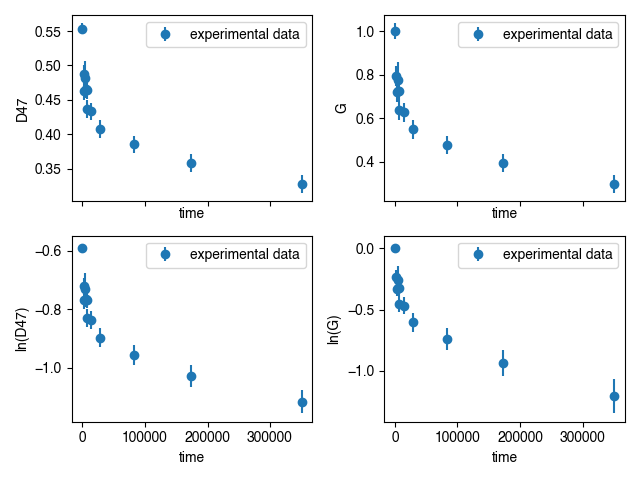
Finally, this imported data can be visualized by plotting in various ways:
#import additional packages
import matplotlib.pyplot as plt

#make an axis
fig, ax = plt.subplots(2,2,sharex = True)

#first, plot D
ax[0,0] = he.plot(ax = ax[0,0], yaxis = 'D', logy = False)

#second, plot G
ax[0,1] = he.plot(ax = ax[0,1], yaxis = 'G', logy = False)

#third, plot log(D)
ax[1,0] = he.plot(ax = ax[1,0], yaxis = 'D', logy = True)

#finally, plot log(G)
ax[1,1] = he.plot(ax = ax[1,1], yaxis = 'G', logy = True)
Calculating Rate Parameters
The next step is to fit the heating experiment data with one of the avaialable kinetic models in order to generate rate parameters. This is done as follows:
#for fitting the Passey and Henkes 2012 model:
kd_ph = ipl.kDistribution.invert_experiment(
        he,
        model = 'PH12',
        thresh = 1e-8, #needed to determine which points are "linear"
        )

#for fitting the Henkes et al. 2012 model:
kd_hea = ipl.kDistribution.invert_experiment(
        he,
        model = 'Hea14',
        )

#for fitting the Stolper and Eiler (2015) model:
kd_se = ipl.kDistribution.invert_experiment(
        he,
        model = 'SE15',
        mp = 0.0992 #can pass a value to force the pair/pair_random slope
        )

#finally, for fitting the Hemingway and Henkes (2021) model:
kd_hh = ipl.kDistribution.invert_experiment(
        he,
        model = 'HH21',
        fit_inv = True #include the inversion as well as the lognormal fits
        )
And resulting rate data can be seen and exported as follows:
#to see the data on the command line
kd_hh

#to export as csv
kdsum = kd_hh.summary
kdsum.to_csv('name_of_file.csv')
Forward Modeling and Visualizing Results
Once the rate parameters are calculated, one can plot these back on to the measured experimental data to visualize fits:
#forward model the data
he.forward_model(kd_hh)

#now re-plot
fig, ax = plt.subplots(1,1)

#experimental data plt.errorbar dict
ed = {'fmt' : 'o', 'ecolor' : 'k'}

#forward-modeled mean plt.plot dict
ld = {'linewidth' : 2, 'c' : 'k'}

#forward-modeled uncertainty plt.fill_between dict
fbd = {'alpha' : 0.5, 'color' : [0.5, 0.5, 0.5]}

#plot the data
ax = he.plot(ax = ax, ed = ed, ld = ld, fbd = fbd, plot_reg = True)

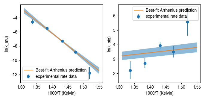
Calculating Activation Energies
Calculating From Rate Data
Once a set of heating experiments performed at a range of temperatures have been imported and their rate parameters have been fit, these can be combined to determine the underlying activation energy values using an Arrhenius approach. isotopylog does this by generating an instance of the ipl.EDistribution class:
#make a list of kd objects (generated as described above)
kd_list = [kd1, kd2, kd3, kd4]

#makde the EDistribution object
ed = ipl.EDistribution(kd_list)
Similar to the ipl.kDistribution class, these results can be visualized and exported as follows:
#to see the data on the command line
ed

#to export as csv
edsum = ed.summary
edsum.to_csv('name_of_file.csv')
Importing and Updating Literature Values
It is expected that most isotopylog users will not be generating new heating experiments and calculating their own activation energies, but rather will be using literature values to say something about the geologic history of their natural samples. In this case, isotopylog makes it easy to import literature activation energy estimates and directly create an ipl.EDistribution object containing these data:
#make EDistribution object
ed = ipl.EDistribution.from_literature(
        mineral = 'calcite',
        reference = 'SE15' #for example, import Stolper and Eiler (2015) data
        )
Similarly, some users might want to import literature values and append their own heating experiment data to this list to generate updated activation energy estimates. This can be done as follows:
#to append with a single experiment contained in a kDistribution object
ed.append(kd_se)

#to append multiple experiments contained in a different EDistribution
ed.append(ed2)
Finally, individual data points (e.g., outliers) can be manually dropped according to their index within the ec.kds list:
#say, drop element zero
ed.drop(0)
Plotting Activation Energies
Furthermore, activation energy Arrhenius plots can be easily visualized. For example, assume we have some ipl.EDistribution object that was fit using the Hemingway and Henkes (2021) model type. Then, we can visualize these results as follows:
#make figure
fig, ax = plt.subplots(1,2, sharex = True)

#plot results
ed.plot(ax = ax[0], param = 1) #to plot mu_E
ed.plot(ax = ax[1], param = 2) #to plot sig_E
Mapping Back to Rates
In addition to modeling activation energies from a set of rate data, one can back-calculate the expected rate parameters from activation energy values:
#say, calculate data at 425 C
T = 425 + 273.15

#assuming EDistribution instance, ed
kd_from_ed = ipl.kDistribution.from_EDistribution(ed, T)
This ipl.kDistribution object can then be forward-modeled onto heating experiment data (as above) to add another layer of data-model fit visualization. That is, this will give the expected heating experiment evolution as predicted by the activation energy values.
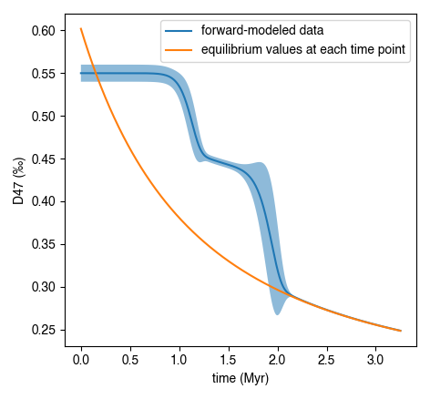
Determining Geologic Reordering
Finally, perhaps the most frequently utilized feature of isotopylog will be the ability to generate clumped isotope evolution plots for any arbitrary time-temperature history. For example, this can be used to assess the likelihood that measured ∆47values represent primary signals, or if these have been diagenetically overprinted. Similarly, one can estimate geologic cooling rates by evaluating the ∆47”closure” temperature for geologically heated samples.
Both of these tasks are trivial in isotopylog. For example, overprinting during heating can be calculated as follows:
#generate EDistribution instance from literature
ed = ipl.EDistribution.from_literature(
        mineral = 'calcite',
        reference = 'SE15',
        Tref = 700)

#define the initial composition and the time-temperature evolutions
d0 = [0.55, 0, 0] #starting D47 = 0.55, d13C and d18O both zero
d0_std = [0.010, 0, 0] #assume some reasonable D47 uncertainty

T0 = 25 + 273.15 #assume starting at 25C, ending at 350C
Tf = 350 + 273.15
beta = 100/(1e6*365*24*3600) #100C/million years, converted to seconds

t0 = 0
tf = (Tf-T0)/beta
nt = 500

T = np.linspace(T0, Tf, nt)
t = np.linspace(t0, tf, nt)

#now calculate D at each time point
D, Dstd = ipl.geologic_history(t, T, ed, d0, d0_std = d0_std)

#plot results, along with equilibrium D at each time point
Deq = ipl.Deq_from_T(T)
tmyr = t/(1e6*365*24*3600) #getting t in Myr for plotting

fig,ax = plt.subplots(1,1)
ax.plot(tmyr, D, label = 'forward-modeled data')
ax.fill_between(tmyr, D - Dstd, D + Dstd, alpha = 0.5)
ax.plot(tmyr,Deq, label = 'equilibrium values at each time point')

ax.set_xlabel('time (Myr)')
ax.set_ylabel('D47 (‰)')
ax.legend(loc = 'best')
Note the non-monotonic behavior that arises from the intermediate “pair” reservoir (see Stolper and Eiler 2015, Lloyd et al. 2018, and Chen et al., 2019 for further details).
Similarly, one can estimate cooling closure temperatures. This is identical to the above example, only the temperature axis is reversed and D is assumed to be in equilibrium at T0:
#reverse T and Deq arrays
T = T[::-1]
Deq = Deq[::-1]

#make D0 in equilibrium
D0 = ipl.Deq_from_T(T[0])
d0 = [D0, 0, 0] #still d13C and d18O of zero

#fit the new t-T trajectory
D, Dstd = ipl.geologic_history(t, T, ed, d0, d0_std = d0_std)

#plot the results
fig,ax = plt.subplots(1,1)
ax.plot(tmyr, D, label = 'forward-modeled cooling data')
ax.fill_between(tmyr, D - Dstd, D + Dstd, alpha = 0.5)
ax.plot(tmyr,Deq, label = 'equilibrium values at each time point')

ax.set_xlabel('time (Myr)')
ax.set_ylabel('D47 (‰)')
ax.legend(loc = 'best')

There are numerous ways that one can visualize these geologic history results, some of which are shown in further detail in the “examples” page.